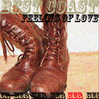

We also linked the photos by the effect that is on them which we added was was called noise this made the phots much more professional to the audience which is very important selling point, because if a photo does not look professional then it affects the whole of image of the pack and it will make it look unappealing to the buyer. Before the photo without the effect it did not look so professional but with the effect it looks much more appealing and visualising pleasing. With where the dd is going to be placed once again we used the whole idea of the running colours in the digipack along with the font that we used. With this section of the pack it was very much to make it clear that it was best coast a convention which was not so dominate in our research but as a group descided that it looked very nice and that it portrayed a quirky aspects to the digipack which reflects the genre of the music and the music video. with the photos it linked to the music video a convention which was commonly used in the world of the music industry.


Next is the back section to the digipack this section includes a track listing a barcode and the record company and coyright. All these conventions were definately a must have in the digipack because without it these features it will not be a proper digipack. These features develop and use the conventions of the media product.

A lyrics section was also a important factor that would complete the digiapck into making it a digpack that would be extremely professional in all the digipacks that we had researched as a group we also found out that lyrics pages were very popular and a running theme throughout it.

