Friday 10 December 2010

Katy Perry 'Teenage Dream' Digipak Example - Scarlett Giannotti

Katy Perry's 'Teenage Dream' Digipak consists of 17 tracks and is the third studio album by American singer-songwriter Katy Perry. It was released in the United States on August 24, 2010.
It’s Pop-Rock Genre has a Length of 58:24 minutes and was co-produced by record Label Capitol and Producers Ammo, Benny Blanco, Dr. Luke, Max Martin , Tricky Stewart, Stargate, Sandy Vee, Greg Wells.

The covers of the first two singles were photographed by Emma Summerton in April 2010, and three other pictures taken by the artist were released to promote the album in July. The official album cover was painted on canvas by Will Cotton and released on July 21 via live webstream, which shows Perry lying naked on clouds of cotton candy.
The album debuted at number one on the US Billboard 200 chart, with first-week sales of 192,000 copies. In Canada, the album debuted at number one on the Canadian Albums Chart selling 26,000 copies. In Australia, the album also debuted at number one, as well as having been accredited with a Gold certification for sales of over 35,000 copies. In the UK Teenage Dream debuted at number one with sales of 54,176!
Here whole fun persona is Crazy, wacky and colourful which is portrayed by the packaging as a whole; even the CD inside has a sweet like design.
Parental Advisory is a message affixed by the Recording Industry Association of America (RIAA) to audio and recordings in the United States containing excessive use of profane language and/or sexual references.

Originally, the sticker was a square with a dotted white line near the center of the sticker. The phrase "EXPLICIT LYRICS" was marked on the top, and "PARENTAL ADVISORY" on the bottom. The first incarnation of the logo, introduced in 1990, used a generic font and was used until late 1993, when it was redesigned with a white box in a black rectangle instead of a white bar between black bars. This continued until 1994 before the change which is still today. I researched this Information from Wikipedia.


Beyonce 'Greatest Hits' Digipak Example - Scarlett Giannotti

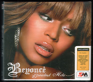
Beyonce's 'Sexy yet Lady like' style (as quoted by Beyonce) is represented through the convention use of varied images of the Artist. Adding an extra quality and purchase to the Digipak increasing value and sales.This 'Greatest Hits' Digipak consists of B'day; B'Day is the second studio album by the American R&B singer Beyonce Knowles, it was released on September 4th, 2006, by Columbia Records in collaboration with Music World Music and Sony Urban Music.
While on vacation after filming for Dreamgirls, Knowles began contacting various producers; she had employed technique for faster collaboration, and completed B'Day in three weeks. Most of the lyrical content of the album was inspired by Knowles' role in the film. The album's musical style ranges from '70s to '80s funk and balladry to urban contemporary elements such as hip hop and R&B. Live instrumentation was employed on most tracks as part of Knowles' vision of creating a record using live instruments.
The album debuted at number one on the U.S. Billboard 200 chart, selling 541,000 copies in its first week!
The front of the Digipak is another Sexy yet lady like image, engaging buyers attention to immediately identify Beyonce and her music as RnB, assisted by her styling and pretty graffiti type font. The promotional sticker advertises what special features the Digipak includes to pursue sales. Reviews, Legal recommendations, time, tracks per CD, copyright and the bar code are all expected to be included on the back cover of the Digipak.

The Beatles 'Greatest Hits' Digipak Example - Scarlett Giannotti

The conventions used within this Digipak wrapping design immediately allow purchasing customers to identify who the Band are, what they look like, reviews from previous listeners, the record label/sponsors, their style and genre of music, the tittle of the album and the songs inclusive. All relevant to pressure its sale. Other information that is usually included in a Digipak design is copyright information, the price of the CD, times of each song, the bar code, age and legal recommendation - such as 'Not for rental'. The Beatles were an English rock band, formed in Liverpool in 1960, and one of the most commercially successful and critically acclaimed acts in the history of popular music. From 1962 the group consisted of John Lennon (rhythm guitar, vocals), Paul Mccartney (bass guitar, vocals), George Harrison (lead guitar, vocals) and Ringo Starr (drums, vocals). There genre embraced the rock and roll of the 50’s but later ranged from pop ballads to psychedelic rock, often incorporating classical and other elements in innovative ways. 'Greatest Hits' Digipak consists of 33 tracks per CD, Greatest hits by The Beatles was released on 13th November 2000. Every No.1 Single released in the UK and USA from 1962 - 1970 was featured on the album, which was recorded on 11th September 1962 – 1 April 1970, EMI, Apple, Olympic and Trident Studios, London; Pathé Marconi Studios, Paris. On the back of the Digipak are songs, listed in order, legal recommendations, reviews, the bar code and copyright information. The spine on the Digipak consists of the Beatles signature tittle, the tittle of the album, sponsors of the album and what type of disk it is.    
The total length is 79:08 and is only in the English Language.
Co-produced by their label Apple/Parlophone, Capitol and Producers George Martin, Phil Spector.


The package of the album was intended to be simplistic and ambitious at the same time. Its cover was designed by Rick Ward, and consisted of Pop-art yellow number one on a background red. On its back cover, the album also included the famous photos of The Beatles taken by Richard Averndon copyrighted on 17 August 1967. (The Band also has the ability to ride off of just their name because of their success) This convention may increase sales of the CD with female fans making purchases to see their heart throbs and even male fans to identify with their idols.The CD includes a 32-page booklet with a coloured page with international picture covers (a total of 163 covers are displayed on the whole booklet) and details (recording date, location, release date, chart stats) for each of the singles.  Their band Name "The Beatles" formatted in their signature font and layout - this label is another symbol and representation of the band and their style - Its not in a Pretty Pink Swirling font.

It was a critical success and has gone on to sell over 31 million copies. It's the seventh best-selling album since May 1991 and the best-selling album in the US from 2000 to 2009.It is the best selling CD of the decade worldwide.


Tuesday 7 December 2010

Weekly Log - Tuesday 7th December by Scarlett Giannotti

This lesson was a continuation on from yesterday; we continued our research into different conventions of a Digipaks, and the different conventions for each genre of Digipak. Our fresh creativity led the beginning plans to our own digipak. We collaborated different ideas together, including what special/required features to include within our design.

We have decided to use the Font: Monotype Corvisa so far but have decided to perform more research into the different type of digipak's to make ours the best it can be.

Monday 6 December 2010

Weekly Log - Monday 6th December - Scarlett Giannotti

This lesson began with an introduction into Digipaks, we were given a brief overview as to what they were but an in-depth analysis of their conventions. Several tasks were allocated and we separated them between our group: I performed further research into the conventions of a Digipak, and evaluated several.
Jessica identified the types of digital technology we used during the planning and production of our music video and how this assisted in our creativity.
Jay and I emailed an email to Best Coast's Record Label Mexican summer, requesting permission to use their "Feeling of Love" song.
Haylie broke down and evaluated conventions of example Digipaks and how they were creative.
The separation of workload was a good idea; more work for our blog was completed in a shorter amount of time; homework I set myself was to read over the work I of my group to understand there research and widen my media knowledge. I also evaluated several of my own example digipaks, assessing their conventions and the Digipaks and Final Music Videos of other students to aid our own digipak development.

Weekly Log- Monday 6th December- Hayley Donovan

On Monday 6th of December , our lesson was based upon the conventions of digipak's. We were introduced to digipak's by our teacher with a brief overview. We were then told the task we had to conduct throughout the lesson period, the tasks given were as the following...


1. Research into the conventions of a Digipak
2. Write about the use of digital technology during our planning and production stage of our music video. and how we were creative
3. Type up an email to the Record Label that owns the song 'Feeling of love', and ask for their permission for us to use it.
4. Find Examples of Digipaks and state their conventions and why are they effective.


In order for all this work to be finished , we assigned each task to a different person in our group, for example...


Jay- Email
Scarlett- Conventions
Jessica- Digital technology and Creativeness
Hayley- Find more than one example of a Digipak


We found this to be a good idea , because as it became closer to the end of the lesson , all of us were just finishing our last sentence , however if we weren't finished we said between all of us, that we need to get it all done by the next day.


In this lesson , our group worked well together in order to get the work finished and if one person needed help another member would be at hand.

Guns N Roses ' Greatest Hits' Digipak Example- Hayley donovan

All Digipak's have similar conventions, however these conventions are purposely portrayed in different ways to reflect the genre of the music.
This example is about the conventions used in the digipak by 'Guns N Roses'. This is in total contrast to the example i wrote about Christina Aguilera as they are completely in different genre categories.


This is an image of the front cover of the 'Guns N Roses' digipak, the convention used is the name of the artists and album printed clearly in the middle. Also the imagery and the background colour reflects the genre in which the band is categorised. The darkness and terrifying skull replicates the heavy rock and heavy metal sung by the band. However one convention they have not used is a picture of the band , this could be because the band is well-known, therefore they do not have to self-promote themselves.


The inside of the digipak, shows typical conventions. Firstly the songs are listed not only on the back but also inside of the front cover, also there is the plastic circles that hold the CD's in place.
    In his particular digipak there are many pictures of the band in typical rock outfits which again reflects the genre they sing.


The back cover included the songs that the CD contains, CD 1 and CD 2 songs are clearly identified , this is a good convention shown of a digipak. There is also a bar code in the right hand corner which is on all digipak's in order for them to be distributed to the audience. Lastly in the small white writing, producers, artistic directors and the record label that Guns N Roses represent are listed.


This is an effective digipak as it contains all the relevant convention for example: name of band and album and songs included on each CD. It is also effective in the way it reflects the genre of heavy metal and rock the dark colours and death like pictures is a clear indication of this.

Conventions of a Digipak - Scarlett Giannotti


A Digipak is a type of packaging for discs; unlike a conventional case with 6 panels it folds out to open. It is made from card that is held within a thin transparent plastic tray. Most commonly used to package special edition CD’s or DVD’s due to the easily modified packaging equipped to hold multiple discs special editing releases.
Digipak is a registered trademark of AGI media who originally developed the packaging style, however the term digipak has come into common use for any similar style packaging. Even when produced by other companies or with varying materials.
Digipak's are an important promotional tool for the artist.

Conventions of a Digipak consist of:
- The name of the Artist
- The name of the Album
- Track listing (include bonus extra's such as 'behind the scenes' and/or 'making of' features)
- Website and MySpace addresses
- Record Label branding
- Pictures of the band members or relevant visual imagery to sell the band (must be a different image to those used on the magazine ad) and it must be manipulated in some way (effect)
- Price
- Website
- Credits
- Recording information, producer, where it was recorded and when
- Who wrote the songs
- Logo
- Barcode
- DVD logo
- CD logo
- Website banner

Stereophonics Digipak Example - Jessica Hung Han Yun

Stereophonics Digipak  is very clear to how they have kept to the conventions. This is because the most immediate convention that they have used straight away is that they have included the song bands name/logo with a very this is what provided the selling point, to an digipack, this is so to inform the audience what they are buying/ who it is by (artist). The front cover of this digipack to the Stereophonics is very appealing with a drawing of a city on the front of it this shows to the audience a very appealing cover as it very unusual., this drawing it not irrelevant however because this digipack is called bartender and the thief,  live from cardiff castle. This drawing is what indicates to the audience that it was performed in cardiff castle. Yet instead of having a photo it has a drawing which makes it much more interesting to the viewer. 


On the inside of the digipack there is a photo of the band, performing in cardiff castle this is to show the to audience the band and the genre that they are (alternative rock), as they are with their instruments. It also shows a little insider to the production of the record. 

The convention that this digipack also uses is the track listing of the songs which have been placed on the back of the digipack this is a very clear convention as this is what the viewer can look at when buying to see what the tracking listings are like this is essential information that must be included. The font that is used is very simple and clear this is to ensure that it clear to the audience/the viewer and so that they can read the important information that is provided.

The design of this digipack is very simple and not to complicated this is a very good feature, as it is simple it ensures that it will not confuse any consumer of this product and if it was a very cluttered looking digipack it would be very unappealing to the eye of the consumer making the digipack less popular compared to other good aesthetically looking products. 
At the back of this product by teh tralisting it also has the barcode a convention and the pricing of the product so to indicate o the information to the consume of this product. This convention that it also uses that it uses for most the digipacks too is a short note from the band. This is on the inside of the digipack, this is from the band who talk about the songs on this product. 


Christina Aguilera 'Bionic' Digipak Example- Hayley Donovan

When i was asked 'what is a Digipak?' i honestly did not have a clue. However after thorough research i realised that i come in contact with Digipaks everyday of my life. A Digipak is a cheaper and easier way to produce an album cover , it consists of six panels, rather than just four.

During my research and the link to conventions of a digipack, i found an excellent example of how a digipak should be presented. This was 'Bionic' by Christina Aguilera.
This example, shows the conventions of a typical Digipak , because firstly they state the Artists name and the name of the album. Which is vital as the audience need an indication of whom the artist of the album is. Also the album cover has a 'Parental Advisory' tag this is important as it indicates that it is not suitable for young children; contains explicit language.


This type of imagery on the front of a Digipak is crucial , as it draws in audience interaction, and has a captivating style, that is hard not to look at!

 
(Front cover of the Digipak)

These images have a great deal of emphasis on the artist , they are  dynamic, the colour is exaggerated to make it more prominent, and it plays a huge part in relating Christina Aguilera to her music.


(Inside of Digipack)
On the inside of the digipack , this is typically what you would see , pictures of artist or band and the actually CD. However this Digipak contains a personal message from Christina which adds a personal touch. Another convention of a digipak is to include the names of produces and artistic directors , which is shown on the far right panel of the 'Bionic' album.


(Inside of Digipak)

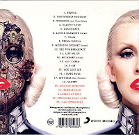
This image shows the back cover of the digipak. This includes all the songs included on the album , the ones that are exclusive are highlighted red , which is a clear indication to the audience. This also includes a bar code and the record label who has ownership of Christina Aguilera herself and her songs ' Sony Music'. And to add visual effects they have included vibrant pictures to again captivate the audience.

(Back of Digipak)

Being creative-Jessica Hung Han Yun

We learnt that producing a music video you need a lot of creativity to be able to get though the process, this is because before its even made you need to be able to visualize in your head how it will look. To start off with we started to research into the music and we had to start to deconstruct the lyrics part by part, this we had to be creative because during this process this is where it started to begin the production as the lyrics is where we did a rough sketch of what the music video could be about. Then producing a storyboard we had draw creatively the different shots that we would be using, we were always considering the different angles that we could use in the video to make sure that there was variety in order for the viewer to get a clearly perspective of the situation in the video.


Being creative was easy as there were 4 of us so we all had different ideas that enabled us to produce a music video that was very unusual. The ideas for the hoes came up as we decided that we didn't want to produce a video that was the same as all the others so we thought what we could produce on our budget. Then the theme of love was also a theme that came up because of the lyrics, it was clear that best coast were talking about love. For the blog we were also creative in the fact that we  had to consider the appearance of our blog which we decided should be simple and  not cluttered with back ground photos or any bright colours that would distract from the work that was being produced and to ensure that that was the main focus of the blog 

Planning the setting and props that we would need, we once again had to think carefully about how our props and our settings would portray and make it clear to the audience what the narrative is. Considering settings we had to visualize in our heads how these shots would look like, whether they would work also when filming, for example we had originally wanted to shot the performance shots in Carnaby street however we thought about it realistically and we decided that it would be much to busy to be able to film usable shots so in the end we decided to use a back street of Brick lane in order to ensure that we got good usable shots. 

From producing the storyboard in planning to filming and editing we were still required to be creative in different ways. For filming we had to be creative in the way that we were doing a a lot of shots that were from the ground so meant that using a tripod was not an option in some of the shots because the tripod would not go down enough for us to succeed in our shot. Instead of using a tripod we decided to use some books to balance and to get a straight shot, this was us using our own imagination as we had to solve a very important problem. 

Editing was another section that would have to  require us to be creative. This was because we had to carefully choose the many clips that we had filmed and creatively put them together via our storyboard, to make a fluid flowing music video. When editing we had to watch each of our clips then decided which  ones we felt would portray to the audience the narrative that we had created. We wanted to make sure that the audience would understand what the video was about. We were able to show to the audience a clear story line by personifying the shoes so that the shoes had human features, making it much more relatable, we had to use of imaginations again to make it realistic. For example we made the shoes be affectionate to each other which made it more human and naturalist. 

E-mail Permission Request - Jay Gomez and Scarlett Giannotti


We researched the contact information of record label Mexican Summer who own the copyright to artist Best Coast in request to seek permission for the use of the track "Feeling of Love".

Using Digital technology-Jessica Hung Han Yun

From starting off the process of producing a music video digital technology was used straight away. Starting up the process we had to start up blog, this blog we keep on updating throughout the production of out music video. At the start we used the Internet to start to research into different music video this research was essential to the process this was because this enabled us to get an idea of the conventions of a music video that we could include. From collecting the information about the conventions of a music video we had to use digital technology for us to broaden and learn more about the process of producing a music video to a high standard. 
We also researched and started to analysis what song we should use, so by using the Internet this enabled us to get information on the artist and the sing so this would give us and insight to what our music video should portray.


Next in using digital technology that we used was the cameras, we had to use the cameras a number of times in the production. We firstly used the cameras when planning, we did this by making a story board (hand drawn) and then we had to develop it into a animated storyboard so this would give us an idea of how our finishing product would look. We had to then use the cameras to film each of the shots that we had drawn, then by using the camera we filmed each shot for at least 5 seconds each so then we could have enough footage just in case. The we uploads this to imovie HD on the apple macs another thing we used from digital technology. By uploading this onto the mac's and by using imovie HD it enabled us to visualize what our music video could potentially look like. In imovie HD it was very important in this process, this was because it enabled us to cut the clips that we had filmed and by cutting this clip we were able to put it to the music that we were also able to upload to imovie HD. 


When it finally came to producing the music video we used the camera  to record however we also used a cannon SLR to take photos of the process and to back up our stop motion. By using the camera we were able to take photos of the process so to refer this back to our bog and to help in showing to the readers how we were able to achieve certain angles. Th SLR camera was also used for the stop motion, as a back up. As we had already done the stop motion clips on the camera  (recording) we were unsure whether it would be okay on recording the clips and so to make sure that we had a back up we took photos on the SLR camera. 


From the filming process we also had to keep on referring back to our blog to make sure that we had to update what we were doing everyday in the filming process. 


Moving on from filming we went back to using the macs for imovie HD, to start the editing process. The editing process was made much easier by the using imovie HD this was because when it came to editing we wanted to use some effects which we were able to do by imovie HD for example when we had to add text to our video it was very simple by going to effects and applying to the video. 


During this proccess we learnt the GREAT importnace of digital technology within the indusrty because without it the media world of course would not be able to survive at all. Digital technology enables you to become creatuve as a person and to capture moments as a director that you are able to share with the world in the eyes of a director. When using the digital technology it enabled me to experiment with the technology that I had to use and even though it was not top of the market technology it did the job and still I was able to create a product that was effective and told the narrative in a way that used effects and a variety. 

Post to Best Coast - Jay Gomez and Scarlett Giannotti


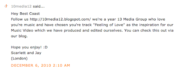
We contacted Best Coast via their Blog; http://bestycoasty.blogspot.com and left a comment with a link to ours. We thought their input and opinion would be useful feedback.