During this process we had to be extremely creative as a group from linking all the products together then to then creating a narrative and an interesting video that would interest the audience and also describe and represent the artist style/genre.
For this process the most important features that enabled us to be creative as using colour, the font, the different shots that were used, the mis-en-scene, the setting, the layout and the effects there were many opportunities that had to make us create something creativity either individually or as a group. During this process what has helped us has been research, imovie hd , photoshop and pages, all these programmes that we have used have been making use produce these products.
It has made us think about how important colour and font is to a product as thisd will reflect a certain style much like the photo of which you use and the way in which you have to in co-operate them together is also a factor which influences how the product will be recieved by the audeinces. Because of these influences towards the audeince, as if you chose the right font colour and photograph then it could look extremely professional and eye catching towards the audience making them want to buy your product meaning you have promoted your product extremely well.
Tuesday, 25 January 2011
Evaluation Activity 2: How effective is the Combination of your Main Product and Ancillary Tasks (Digipack and Advertisement)? - Jessica Hung Han Yun
Here I have evaluated within the video what has been linked from the video to both the digipack and the advertisement. Then below this I have annotated both the digipack and the advertisement where I have expanded and emphasized what has been included within the music video digipack and the advertisement that makes them all link together and create a promotion of the artist/band the record label and the genre/style of the music.


Monday, 24 January 2011
Advertisement: Digital Technology by Scarlett Giannotti
In order to create a professional looking Advertisement we would need to use a specifically featured soft wear with the abilities to do so. On the Mac we have the option between 'Pages', 'Photoshop' and 'Microsoft Word' soft wear. Each have the features for us to produce a professional looking advertisement of our Album. We decided to experiment and use 'Pages' - a soft wear none of us were familiar with as we had already used 'Photoshop' in the production of our Digipak. Pages is a word processor and page layout application developed by Apple; it is an easy-to-use application that allows users to quickly create professional-quality documents on their home computers. A number of Apple-designed templates comprising different themes (such as letters, résumés, posters, and outlines), are included with Pages. Among Microsoft Office applications, it competes with both Microsoft Word and Microsoft Publisher, and has compatibility with both.
The layout of our entire design is to an angle; this was specifically set to give a 'laid back' sense to the viewers; the Music of the band is not dance/ Hard Rock but Mellow therefore the Layout of our Poster also had a Mellow, Chilled feel. We also included boxed text to separate chunks of information making it easier for the readers minds to take in and remember. We had to source the Internet for specific information such as Tour Date and Locations - but we also used images such as the 'ITunes' and 'HMV' logos adding a more universal appeal with an easily recognised logo. Another Image we also used was 'Best Coasts' record label 'Mexican Summer' logo; so the readers are able to identify who the label are and become familiar with the company or recognise it from another band. One of the conventions we included within our Advertisement Final design was a star rating; we selected a star image from the Internet and edited it for our Poster. However when we darkened the background colour we noticed the white background of the star images we had sourced from the ; therefore we use the 'Shape' feature from 'Pages' which allowed use to create a star shape for the ratings without a background.
The layout of our entire design is to an angle; this was specifically set to give a 'laid back' sense to the viewers; the Music of the band is not dance/ Hard Rock but Mellow therefore the Layout of our Poster also had a Mellow, Chilled feel. We also included boxed text to separate chunks of information making it easier for the readers minds to take in and remember. We had to source the Internet for specific information such as Tour Date and Locations - but we also used images such as the 'ITunes' and 'HMV' logos adding a more universal appeal with an easily recognised logo. Another Image we also used was 'Best Coasts' record label 'Mexican Summer' logo; so the readers are able to identify who the label are and become familiar with the company or recognise it from another band. One of the conventions we included within our Advertisement Final design was a star rating; we selected a star image from the Internet and edited it for our Poster. However when we darkened the background colour we noticed the white background of the star images we had sourced from the ; therefore we use the 'Shape' feature from 'Pages' which allowed use to create a star shape for the ratings without a background.
Weekly Log - Monday 24th January - Scarlett Giannotti
We finally completed our digipak design and uploaded and evaluated it onto our blog.
Final Digipack-Group

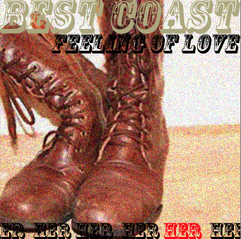
Front cover: 'HER' show (saying 'best coast feeling of love)
Back cover: with the track listing (photo of singer walking awau)
Inside middle: (where the cd will be placed) text on diagonal saying best coast feeling of love
Inside right : 'THEOTHER' shoe
Inside left: Lyrics page (feeling of love)
Outside end pannel: 'HIM' shoe
Digipak: In what way does your digipack use, develop or challenge forms and conventions of real media products-Jessica Hung Han Yun

We also linked the photos by the effect that is on them which we added was was called noise this made the phots much more professional to the audience which is very important selling point, because if a photo does not look professional then it affects the whole of image of the pack and it will make it look unappealing to the buyer. Before the photo without the effect it did not look so professional but with the effect it looks much more appealing and visualising pleasing. With where the dd is going to be placed once again we used the whole idea of the running colours in the digipack along with the font that we used. With this section of the pack it was very much to make it clear that it was best coast a convention which was not so dominate in our research but as a group descided that it looked very nice and that it portrayed a quirky aspects to the digipack which reflects the genre of the music and the music video. with the photos it linked to the music video a convention which was commonly used in the world of the music industry.


Next is the back section to the digipack this section includes a track listing a barcode and the record company and coyright. All these conventions were definately a must have in the digipack because without it these features it will not be a proper digipack. These features develop and use the conventions of the media product.

A lyrics section was also a important factor that would complete the digiapck into making it a digpack that would be extremely professional in all the digipacks that we had researched as a group we also found out that lyrics pages were very popular and a running theme throughout it.


Advertisement: Conventions - Hayley Donovan

Another convention we have used , is an image to represent the artist or album. We used a picture of the shoe as it is an iconic image used throughout our video and is used on the front panel of our digipak therefore we tried to make a link between all three aspects of the coursework.
In the research of advertisements , one of the most common convention we came across were reviews from top music magazine and critics. We decided to add this in as it made the advertisement look professional and the stars add to the whole layout of the advertisement. Another convention we decided to use was what exclusive songs were put on the album and where it could be purchased. This type of convention adds to the advertisement as it catches to audiences eye and it is clear indication to where to buy the album and what the audience should expect.
Tour dates are not essential on an advertisement but we felt it was a nice touch and it enables the band to not only promote an album but also promote there concerts in which people could purchase tickets for.
Lastly we included the record label logo , this was so that copyright could be granted and if the audience see a record label that they have heard quality songs from before then they are likely to buy another album that they have produced.
Choosing the Final Digipak Design and Inspirations - Scarlett Giannotti
The decision on a Final Digipak Design was decided as a group; we combined all of our creative ideas and incorporated it into one combined final Digipak.
It was crucial our Digipak linked with the Poster and Music Video therefore we used the same Font and Images throughout to show the resemblance.
It was crucial our Digipak linked with the Poster and Music Video therefore we used the same Font and Images throughout to show the resemblance.
Evaluation Activity 1: In what ways does your media product use,develop or challenge forms and conventions of real media products?- Group
In what ways does your media product use,develop or challenge forms and conventions of real media products? ( eg. Music Videos)
The Style of Video
Our music video , is quiet unusual as it is based upon a love story between shoes. As this was the case of not using humans our video is heavily based on the narrative , about two shoes falling in love and the man shoe going off with someone else. In order to represent the narrative in a clear way for the audience to understand we used alot of iconography by using symbolic representation for example- when the shoes were waving to each other the front of the shoe was lifted and would move from side to side. The aim of our video was to make the humans seem like humans which was a difficult tasked but the end production showed we pulled it off quiet well. Our music video has elements that challenges the forms of conventions of a typical music video, because the obvious one is using shoes instead of humans or using the actual artist. The video also shows a degree of authenticity, as we have not yet seen a A2 music video using the representation of shoes to symbolise the emotion of human beings.


Settings/Location
For the busker scenes , we used an urban style setting to match the style of the video , this uses the conventions of a typical music video because most music videos use settings to match the style/genre of the song. We felt this urban setting of Bricklane matched the style of the video because the brick wall effect and musty colours eg. Brown emphasised the rustic sound of the song and mirrored the colours of the two shoes in the love. In normal society we associate a love relationship with either a park or a beach , this is what we tried to accomplish , the main setting around the love story was a bench with a bright green field behind it, we did this in order for the audience to relate to the setting and we made it simple so the audience did not get confused we all kinds of different settings. This example uses the conventions, because most music videos have a iconic setting that the audience remember clearly, therefore making an impact on the target audience.


Costume and Props
The props we used developed the conventions of a real music video, because with the busker we used an acoustic guitar this not only emphasised the genre of the song (Indie pop) but showed a representation of a typical busker. We felt this worked well because it was a clear indication to the audience, how we anted to portray the singer. Also by not using people we relied heavily on props to enhance human characteristics, for example: Bowl of crisps in the movie scene and the shoes eating an apple. Here we used conventions of a typical music video as we used props in the correct scenes to enhance the performance. In relation to the costumes , we again used an urban style for the busker/singer to represent the genre of the song. The singer ( Scarlett) wore reds and browns which emphasised the colour scheme throughout out the video, digipak and advertisement.


Performance
The performance aspect in our music video, is a representation of a Busker, singing for money on the streets. This uses the conventions because the performance should reflect the genre of the song, which in terms of our video worked really well. The busker displays the calmness and simplicity of the song which the audience can relate to. The is also a performance by the shoes , the shoes acting like humans brings about a non-traditional feel and challenges the conventions as most music videos using the artist or other people. However in the modern day music videos there are increasingly more videos that are animated and different due to new technology and ideas used from all over the world.


Editing
During the editing process we had to come across the lip syncing the cross cutting and the stop motion. First of all we had to cross cut the beginning footage. This footage(much like we did in the rest of the video) we cross cut it to the beat of the music. So for the beginning we wanted to quickly introduce the artist so we did this by using 2 second cross cutting that are according to the beat of the music. we did this because it was a clear and important convention that we picked up in in all the music videos because of this we thought that cutting all of our footage to the beat of the music was definitely a factor that had to be considered and had to be used. We thought that we did this very well and that all of our cross cutting fits to the best of the music.
next was the stop motion with the first 3 stop motions moments in our video (shoes) it went extremely well and we were very happy with how they turned out. However with the fourth stop motion it did not go so well at the begging this was due to the footage that we had collected. the footage when we stop motioned it was bad because the lighting and on that day it was too muddy so that all together the images were not appealing to the eye make our video look unprofessional. so to change this because we were so unhappy we went out again to redo the filming. when we came back with the footage it was so much more better this was due to the fact that the lighting had improved and there was less mud in the shots, then it was much better and the sots when slop motioned made much more sense in the fact that it went in order rather than before. in the finishing stages of this stop motion process we felt very proud of what we had achieved the introduction of the shoes and the eating of the apples all in stop motion and we felt that it was successfully done as a group.
Next was the lip syncing the lip syncing was done very well we thought with the editing, it went well with the song and with all the shots of the artist it goes in time with the music which was a definitely convention that would have to be used. This once again was a convention that we stopped in every single music video that we had watched so we felt that if we did not include this feature that we would not achieve a good music video that would be viewed. So including lip syncing agreed with the conventions of the music videos. we felt that with this we were successful once again and that we did this to a high standard and to the best of our ability that we could have.


How the Video suggests the Music genre of the Track
Best Coast are categorised as an Indie Pop band; their song 'Feeling of Love' has a melodic, calm but quirky sound which is reflected within our original Music Video, through the use of Mise-en-scene (Actors, Costume, Location and Props). Our narrative is the typical romance genre (well suited to the title) but with a twist - using shoes as representations of people.
The use of colours brown, red, and black were continued throughout our music video, Digipak and Advertisement; these neutral, dark tones also highlight the Indie Pop genre.
The use of Editing consisted of stop motion; which added an interesting, quirky style to our video, slow cross cutting; to enable the audience to focus on one scene and relate to the characters, the longer scene shots also showed our well matched lip syncing, Annotation over shots editing was also used to highlight specific characters.
How does your Video reflect research done into the style of Artists other Videos?
Having researched into several Music Videos both of the band 'Best Coast' (artist of our song) and others. We are able to identify our similar use of conventions.
The Style of Video
Our music video , is quiet unusual as it is based upon a love story between shoes. As this was the case of not using humans our video is heavily based on the narrative , about two shoes falling in love and the man shoe going off with someone else. In order to represent the narrative in a clear way for the audience to understand we used alot of iconography by using symbolic representation for example- when the shoes were waving to each other the front of the shoe was lifted and would move from side to side. The aim of our video was to make the humans seem like humans which was a difficult tasked but the end production showed we pulled it off quiet well. Our music video has elements that challenges the forms of conventions of a typical music video, because the obvious one is using shoes instead of humans or using the actual artist. The video also shows a degree of authenticity, as we have not yet seen a A2 music video using the representation of shoes to symbolise the emotion of human beings.


Settings/Location
For the busker scenes , we used an urban style setting to match the style of the video , this uses the conventions of a typical music video because most music videos use settings to match the style/genre of the song. We felt this urban setting of Bricklane matched the style of the video because the brick wall effect and musty colours eg. Brown emphasised the rustic sound of the song and mirrored the colours of the two shoes in the love. In normal society we associate a love relationship with either a park or a beach , this is what we tried to accomplish , the main setting around the love story was a bench with a bright green field behind it, we did this in order for the audience to relate to the setting and we made it simple so the audience did not get confused we all kinds of different settings. This example uses the conventions, because most music videos have a iconic setting that the audience remember clearly, therefore making an impact on the target audience.


Costume and Props
The props we used developed the conventions of a real music video, because with the busker we used an acoustic guitar this not only emphasised the genre of the song (Indie pop) but showed a representation of a typical busker. We felt this worked well because it was a clear indication to the audience, how we anted to portray the singer. Also by not using people we relied heavily on props to enhance human characteristics, for example: Bowl of crisps in the movie scene and the shoes eating an apple. Here we used conventions of a typical music video as we used props in the correct scenes to enhance the performance. In relation to the costumes , we again used an urban style for the busker/singer to represent the genre of the song. The singer ( Scarlett) wore reds and browns which emphasised the colour scheme throughout out the video, digipak and advertisement.


Performance
The performance aspect in our music video, is a representation of a Busker, singing for money on the streets. This uses the conventions because the performance should reflect the genre of the song, which in terms of our video worked really well. The busker displays the calmness and simplicity of the song which the audience can relate to. The is also a performance by the shoes , the shoes acting like humans brings about a non-traditional feel and challenges the conventions as most music videos using the artist or other people. However in the modern day music videos there are increasingly more videos that are animated and different due to new technology and ideas used from all over the world.


Camera work
We used a variety of shots to incorporate our ideas of what we had in the storyboard into the final video. We used long shots to set out a scene. For example when we had a shot of the artist performing. Close ups were used a lot through the video as we were emphasizing the connection and the relationship between the two pairs of shoes portraying emotions. We also used close ups at the start of the video so that the cuts could go with the pace of the music in the introductory bit before singing started.
A pan shot was used right at the end of the video to identify that the artist was one of the characters in the relationship between the two pair of shoes in the video.


Editing
During the editing process we had to come across the lip syncing the cross cutting and the stop motion. First of all we had to cross cut the beginning footage. This footage(much like we did in the rest of the video) we cross cut it to the beat of the music. So for the beginning we wanted to quickly introduce the artist so we did this by using 2 second cross cutting that are according to the beat of the music. we did this because it was a clear and important convention that we picked up in in all the music videos because of this we thought that cutting all of our footage to the beat of the music was definitely a factor that had to be considered and had to be used. We thought that we did this very well and that all of our cross cutting fits to the best of the music.
next was the stop motion with the first 3 stop motions moments in our video (shoes) it went extremely well and we were very happy with how they turned out. However with the fourth stop motion it did not go so well at the begging this was due to the footage that we had collected. the footage when we stop motioned it was bad because the lighting and on that day it was too muddy so that all together the images were not appealing to the eye make our video look unprofessional. so to change this because we were so unhappy we went out again to redo the filming. when we came back with the footage it was so much more better this was due to the fact that the lighting had improved and there was less mud in the shots, then it was much better and the sots when slop motioned made much more sense in the fact that it went in order rather than before. in the finishing stages of this stop motion process we felt very proud of what we had achieved the introduction of the shoes and the eating of the apples all in stop motion and we felt that it was successfully done as a group.
Next was the lip syncing the lip syncing was done very well we thought with the editing, it went well with the song and with all the shots of the artist it goes in time with the music which was a definitely convention that would have to be used. This once again was a convention that we stopped in every single music video that we had watched so we felt that if we did not include this feature that we would not achieve a good music video that would be viewed. So including lip syncing agreed with the conventions of the music videos. we felt that with this we were successful once again and that we did this to a high standard and to the best of our ability that we could have.


How the Video suggests the Music genre of the Track
Best Coast are categorised as an Indie Pop band; their song 'Feeling of Love' has a melodic, calm but quirky sound which is reflected within our original Music Video, through the use of Mise-en-scene (Actors, Costume, Location and Props). Our narrative is the typical romance genre (well suited to the title) but with a twist - using shoes as representations of people.
The use of colours brown, red, and black were continued throughout our music video, Digipak and Advertisement; these neutral, dark tones also highlight the Indie Pop genre.
The use of Editing consisted of stop motion; which added an interesting, quirky style to our video, slow cross cutting; to enable the audience to focus on one scene and relate to the characters, the longer scene shots also showed our well matched lip syncing, Annotation over shots editing was also used to highlight specific characters.
How does your Video reflect research done into the style of Artists other Videos?
Having researched into several Music Videos both of the band 'Best Coast' (artist of our song) and others. We are able to identify our similar use of conventions.
Camera Shots:
Music Videos tend to include many longshots, close-ups and mid shots. This is create emphasis on the artist, location and emotions. Also close-ups are used no only to show emotions but to reflect the words of the song with the artists lip movements.
Camera Movements:
The movement of the camera is used to follow and trace the Artist/Band. Camera movements include tilts, Pan, Tracking and Crane Shots.
Mise-en-Scene:
This refers to the arrangement of the performers and props on stage or in a scene for a production of a music video or any other media text. Mise-en-Scene puts importance onto the representation of something.
Editing:
Jump Cuts is the predominant editing Technique used in Music Videos. This is because it allows a sudden change from one scene to another. Similarly transitions such as fade and dissolve are very common in Music Videos as they create different effects to cuts.
Other Main General Conventions consist of:
Lighting - Some Music are in Black and White which emphasis a particular mood and some videos have artificial lighting which put the artists in an enhanced look.
Sound - Sound is mainly the vocals of the song, but in some cases such as Micheal Jacksons 'Thriller' Producers can make the video into a short film and add Diologue and VoiceOvers.
Props - Props are vital to add to a scene, they create sinificance on particular objects/People.
Costume - Goes with scenes in the song and reflects genre. Costume is important is an important factor because it has slight influece on how viewers will dress because some see celebrities as idols.
Colour - Tend to set the mood of the song through creating an atmosphere. Dark Colours used more in Rock genres and colour in Pop/Hiphop Videos.
Music Video Conventions for the Majority of these Specific Genres
Indie/Rock -
- Tends to be Black and White
- Artists/Band Shown throughout Video
- Extreme Close Up's and Long Shots
- Dark Locations
- Some use of special effects
Sunday, 23 January 2011
Advertisement:Colour- Hayley Donovan

On our advertisemtn we wanted to keep , the colour of our digipak the same to our advertisement , as we thought that these colours could be associtaed with the band.
Title: We chose this creamy colour for the advertisement and digipak , because it makes the bands name stand out as it is the only word in that colour on the whole advertisemtn , so it shows its importance.
Picture: On the image , we added in one red coloured word , we thought this was effective as it shoes its the odd one out , as we felt the song was quiet perculiar.
Tour Dates, Reviews: We ut this context in white , because it stands out against the dark background, however doesnt over power the title or picture.
Red Font: We put the ' Album out now' in red , as we felt that it is one of the most inportant parts of the advertisement as it is a clear indication to the audience. The red brings out the fierceness of the words as we were trying to empahsise the release of the album.
Stars: We put the review stars in a bright yellow/gold colour to enhance the quality of the songs and wanted it to attract the audiences attention.
Weekly Log 18th January 2011- Hayley Donovan
In todays lesson, the focus was the Evaluation section of the coursework. We were given a sheet with all the questions we had to answer. We worked on Evaluation 1 in lesson , jay and I wrote our answers in rough first this enabled us to get all our answers down on paper and plan how we were going to construct each paragraph.
Our teacher gave us two options , that we could present our Evaluation section as...
1. 9 images from our video and write a paragraph each on them.
2. Construct a short film, with an individual speaking about their Music video. ( Editing required)
We chose to do option one , becuase we thought we could add in more content , if we wrote each paragraph.
How we Produced our Digipack-Jessica Hung Han Yun
Photoshop on mac
When producing the digipak considering what the aim was for the audience response to it was the first theme that was encountered. I thought that the most important thing the we want the audience to think with the digipack is that its appealing and to make a clear distintive link to the music video this resulted in making sure that we used the characters within the video. So by using photos of the 'her' show the 'him' shoe and the 'the other' shoe this would ensure that the audience would understand what we are trying to attempt to achieve in this digipak. The meant that the first thing we wanted to establish was that it linked then next it was onto the content. From our research on digipacks there we definately conventions that were used in every pack this created a pattern that we noticed and this helped us in the deciding what was important to include within the pack within the written side. This was the lyrics then the track listing information on the record label (copyright) and of course including the bands name. This was a simple task to make clear on what we wanted. We found it easy to do these two tasks mainly because we already had an idea of what we wanted out of our digpacks and what we wanted to audience to see when they saw such a product on the market.
Next we then had to go about getting the photos of the shoes that we wanted. In these photos the important features that I wanted to ensure was being shown was that the way in that the shoes were placed in the photo would be very significant, as I wanted to humanise the features in the photos of the shoes. This was to make the video more realistic in a way and also to link back to the video to make it clear that it wasnt just shoes being photographed however they were as though they were human.
Then i also researched into the size and propotion of the digipack. Which was easy to find over the internet yet also to make sure that it was correct having to look myslef by actually measuring a digpack, which was 12cmx12cm.
Then from this stage I began to experiement with what I could achieve on photoshop on this I leanrt short cuts so that I could achieve effects on the digipack quicker I did this before we needed to start the digipack. For example I learnt about the layers that are involved within a graphic design in photoshop. These layers are extrmeley useful howevr at first are a bit of a pain however you need time to get use to them and then you start to see the way that the work and how that they are extremely useful in producing a graphic design. This is because teh layers enable you to focus as a design on a feature of the design then if enables you to just edit that specifically so it tailors to what you want as a designer. A short cut that I learnt was how to change the background when you first go into photoshop. When you first get onto a new page I chose my measurements of 12x12 this made sure that the space I was working in was the space in which would be the correct size to what the digipack would actually be like. Then the first layer that is then on the new page is the baklcground this background is locked usually however can be unlocked this i did unlock so that I could change it to experiement with the colours within the background to see what would suit the style the best. Then for changing the background i clicked onto that layer then by using the keyboard i used the shortcuts: COMMAND SHIFT RETURN to get a colour chart up of whihc i then chose a colour then to apply to the background layer I pressed: ALT and DELETE, this then applied the colour to the background layer
Another trick that I learnt that I felt was important to the process of the making of the digipack was adding swatches to the colour palatte in photoshop. This was importnat because I was using different colours for the font and for other features in the digipak I chose colours which we from a colour charct and to save them so that I could refer to them later to ensure that it the correct matching colour to the previous page of the digpack (to make it match linking it) I made the colour i chose as a swatch on the colour palatte. To do this i chose the colou rthen on teh right hand side to this was a button called 'add swatch' of which i pressed then this colour came up on the sidebar which i then could refer to when i needed to do so in other sections of the digipack.
Cropping the photo and edditng the size of the photos was also a problem that I encountered as I wasnt sure how to edit this. So i researched how to and I found that editting the image side in edit was how you could do this. So i went to edit to image size to edit it to 12x12 however because some of the photos (backcover and middle covers) were taken and not to a square size however they were taken and the camera converted them into a rectangle shape the 12x12 did noy come out so this meant thta instead i had to change the canvas size. The canvas size then meant that it in a way cropped the photo of which I dragged to centre to ensure that the photo was focused on the shoes.
Effects was what I also inculded within the digipak. The effect that I used on all the photos was in 'filter' under filter i experiemented with blur however I felt that this did not achieve what I or the group wanted however i then experimented with the filter 'noise' of which my first reaction was that it was amazing and was achieving excaltly what i and the group wanted. It was also how i picutured the photos to be like, another reason for this effect is that its unusual and is quirky which was an aim for the digipak as we felt thats what the song was like and how our video came across as. So with this filter effected called noise I was able to create a eye catching and eye pleasing design. To ensure that it linked to the whole of the digipack I felt that I had to put this effect to every photo. At first I was unsure of how this would come out to be like however when it was added (the effect) to every photo I loved the finished effect it gave and it fitted with all the photos really well giving them character and also giving the photos more of a vintage and a unquie look.
A challenge that was also definately faced was also to do with the font of the writting. Deciding on the font rosewood std was because it was very fancy which made it stood out in our digpack as our digiapck is very simple which we thought was more effective rather than having to much information and to much clutter on the pages of the digipack. So the font would stand out, it had circus feel to it and this was very nice to have as an effect for the design. With the writting on a certtain page I had to roatate the writting. I had to do this by going to 'free transform' under 'edit'. This then enabled me to freely handle the font.
In choosing the colour for the font it was at first because it looked nice on the frount cover however then it developed into a theme that I felt and the group felt should run throughout the digipack. The colours that i chose i made into swatched so that i could use them again and again in the digipack. The colurs also matched eachother and none of them clashed with eachother or none of the colours over lapped when you looked at them . However all the colours within the pack matched really well and made it very appealing to the eye and to look at in general.
Photoshop was such an major programme that was used in producing the digipack it was so importnat without it we would not have ended up with such a professional looking digipack that would be very convincing to anyone who saw it. Th epragramme phtoshop I first found hard to use adn hard to get use too however when researching and praticing the techniques that could be achieved in photoshop I found it easy and very simple, yet it gave such a professional finish and such an appealing digipack.
By using photoshop it also gave a taster to how the industry producers such a product as a digipack how they use photoshop to design professional looking products that entice the audience and the consumer. It gave me and idea of how importnat shuch a pragramme is to this, it enabled me to be creative to experiement yet easily change certain aspects of the product. It also enabled me to learn how this process works from the ideas then into producing it into a real proper product.
Subscribe to:
Posts (Atom)